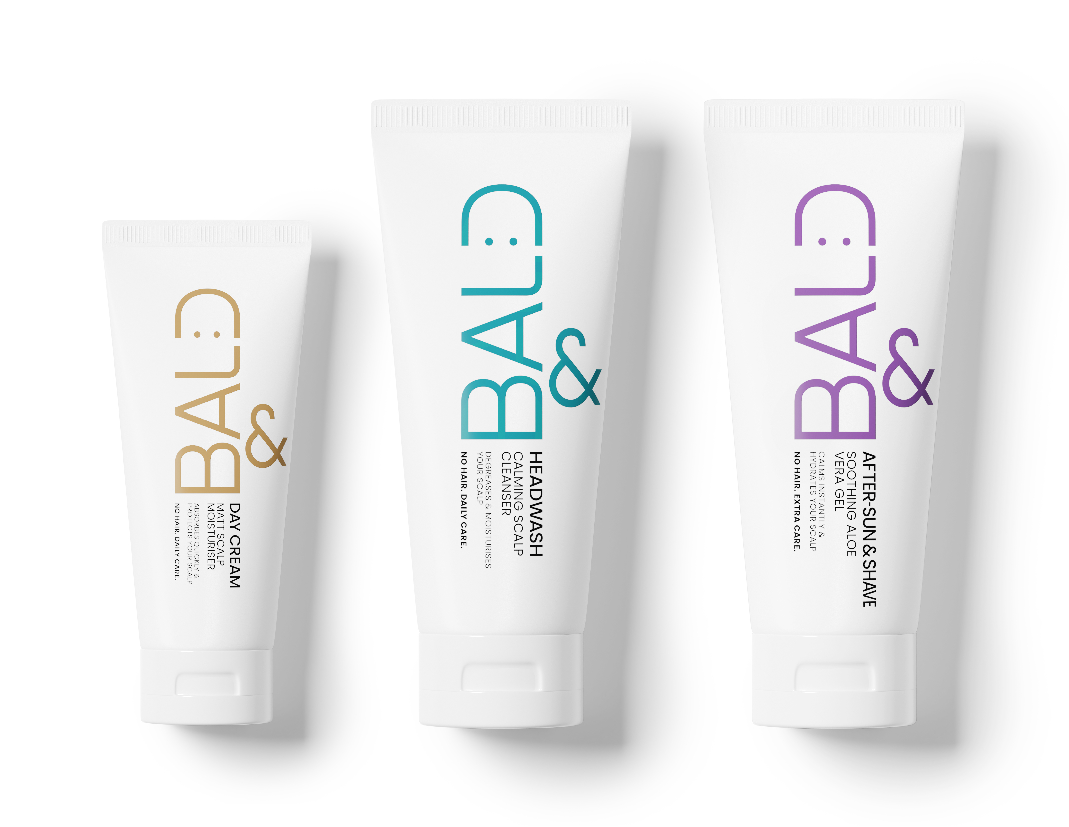
Visual identity for Bald& was created together with client to launch this new brand. We first developed mood boards together with concepts to help focus positioning and direction of the brand.
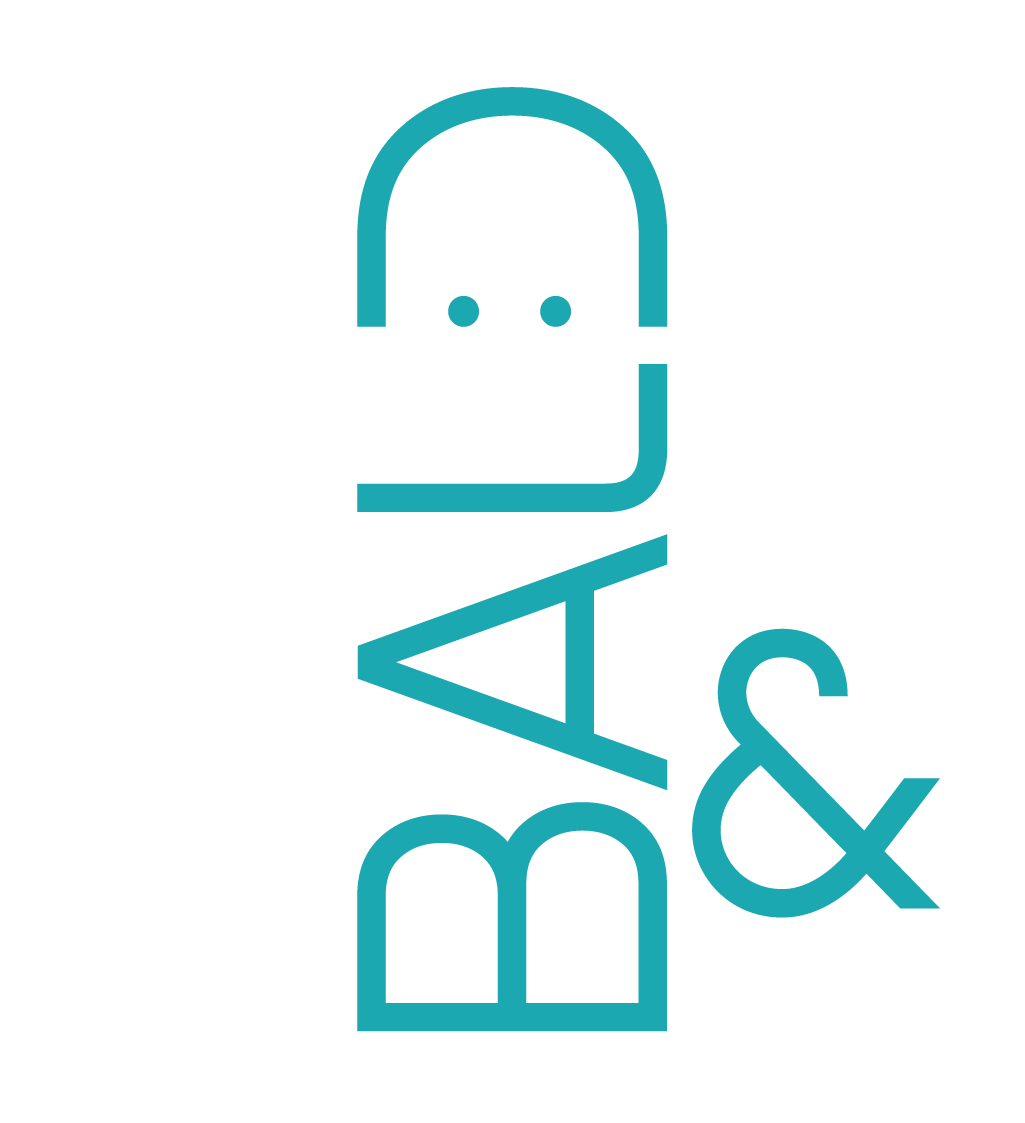
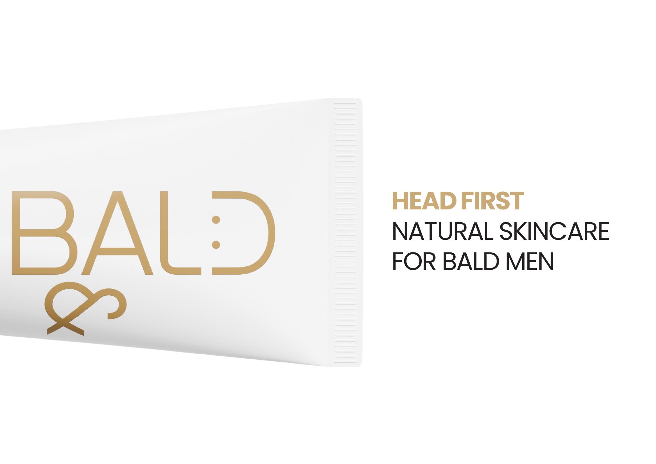
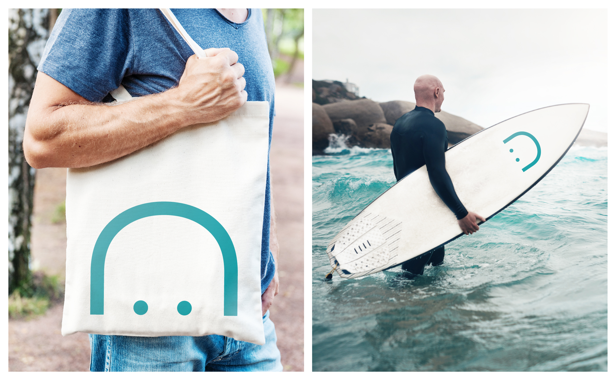
A balance has been found with a clean professional identity, but with a little sense of humour. The final design makes playful use of typography in the logo and in turn the visual identity. The ‘D’ in BALD is modified to illustrate a bald head. This iconic letter can then be used in communication in a fun and memorable way.
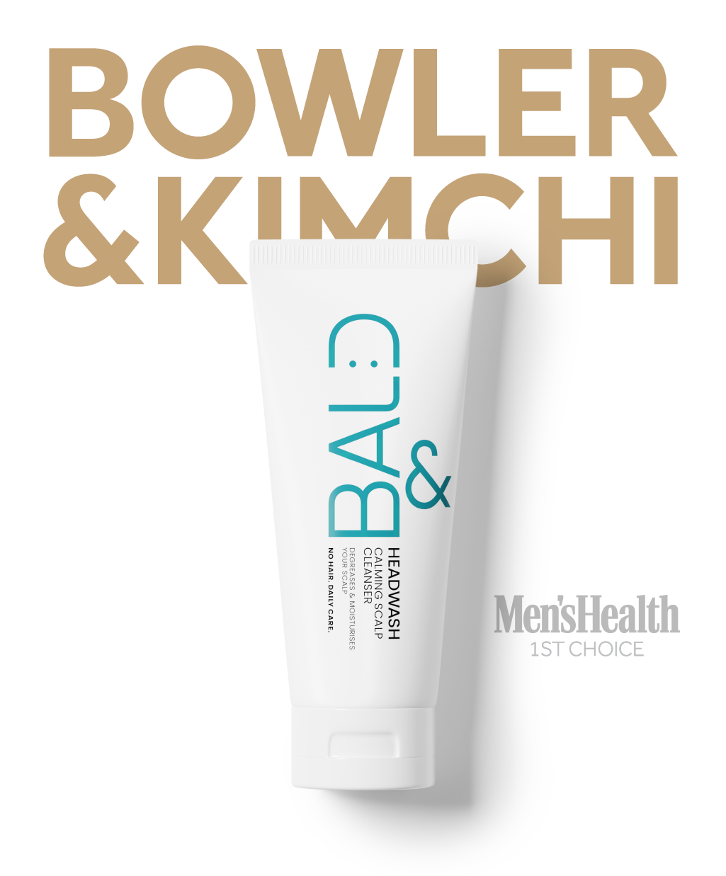
As a nice bonus the headwash product was selected as first choice by Men’s Heath.
CLIENT BALD&
AWARDS Men’s Health 1st Choice
EXPERTISE Brand Identity Packaging Design, Illustration Photography, Communication