

STANDING
ON YOUR
OWN
STRENGTH
Brand strategy and brand identity for Kracht Centrale. Kracht Centrale is a company helping athletes to achieve there goals. This is both support on mental as well as physical development. All ages and skill levels are targeted with the aim of being able to help any individual.
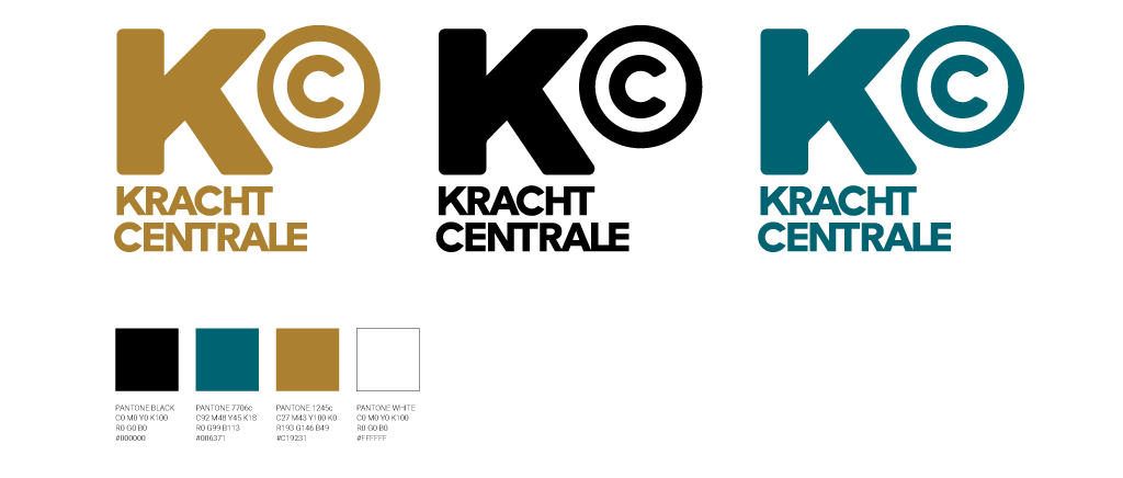
The logo has a bold letter ‘K’ from “KRACHT’ (STRENGTH) and a symbol ‘©’ from ‘CENTRALE’ (CENTRAL) with the circle representing centre, protection and inner focus. Campaign and positioning copy “IN JE EIGEN KRACHT STAAN’ which translates as “STANDING ON YOUR OWN STRENGTH’ is central to the vision. We assisted with the brand identity translation to the interior styling and branding of the brand new sports and treatment location in Zwolle.
CLIENT
Kracht Centrale
EXPERTISE
Design Strategy, Brand Identity
Interior Branding