

‘PLAySTICs’
NATURAL
FRUIT JUICE
FOR KIDS
A SECOND LIFE
FOR PACKAGING
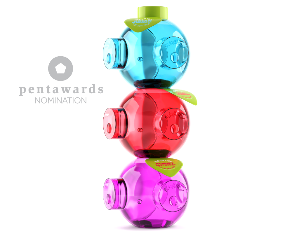
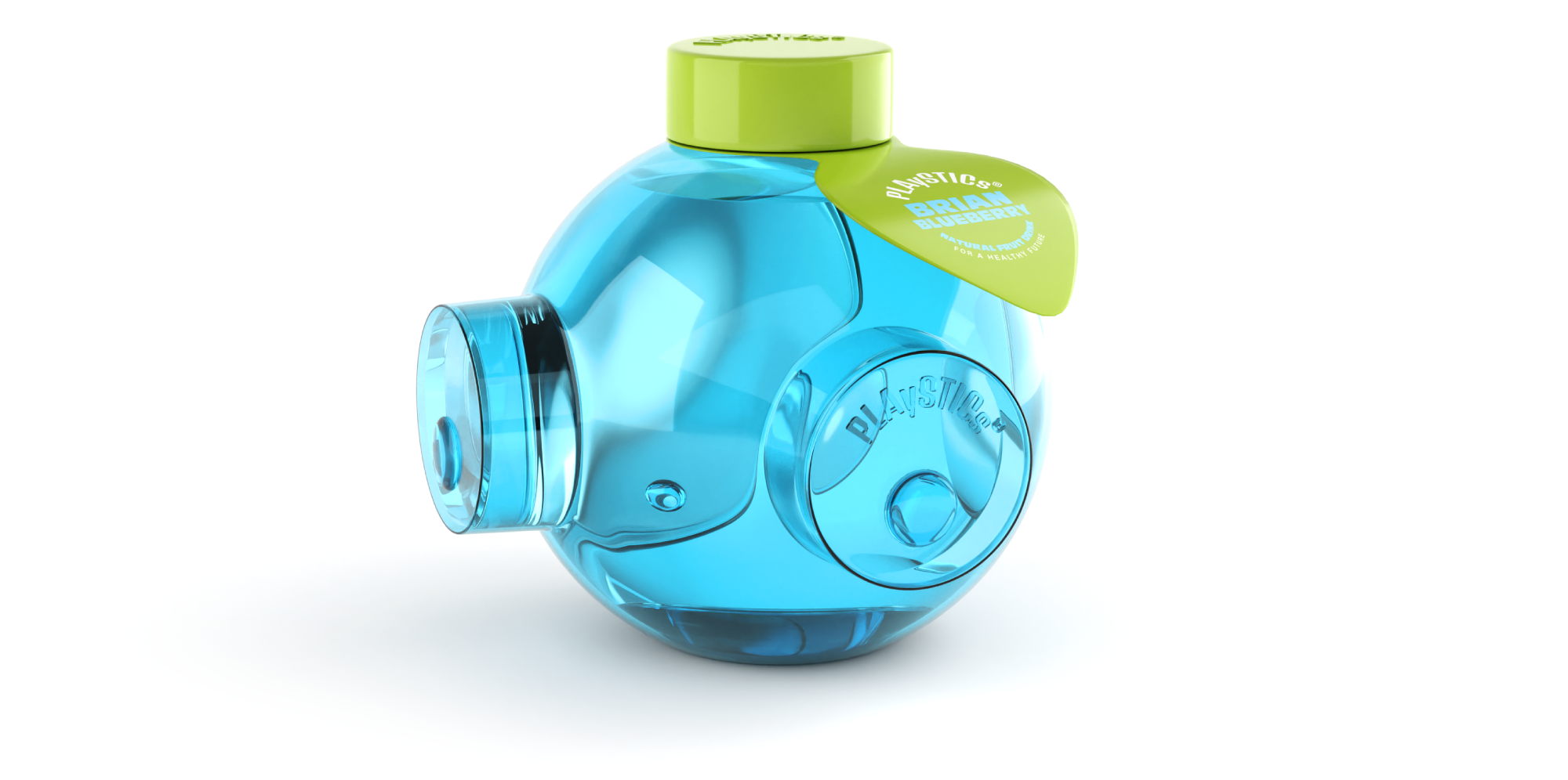
Plastic today is almost a bad word in the world of packaging with the pressure to reduce its use. However plastic is still a great material and currently still the best option in many cases. Kids drinks contribute to so much plastic wastage, so instead of disregarding the material we want to reduce chance that it’s thrown away. Our design for a reusable bottle has a built-in function that it can be played with. The concept is in the name, ‘PLAySTICKs’. The word ‘PLASTIC’ is combined with lower case ‘y’ and “s” to include the element of play.
The vibrant shiny coloured recycled plastic balls are eye catching with great shelf impact. We created little characters with eyes, nose and leaf shape label cap to add further appeal. Designed so that each facing has either a hole or a peg including the cap, the balls can be joined together in many directions.
CLIENT
B&K
AWARDS
Pentaward Nomination
EXPERTISE
Packaging Design
3d Design, Animation