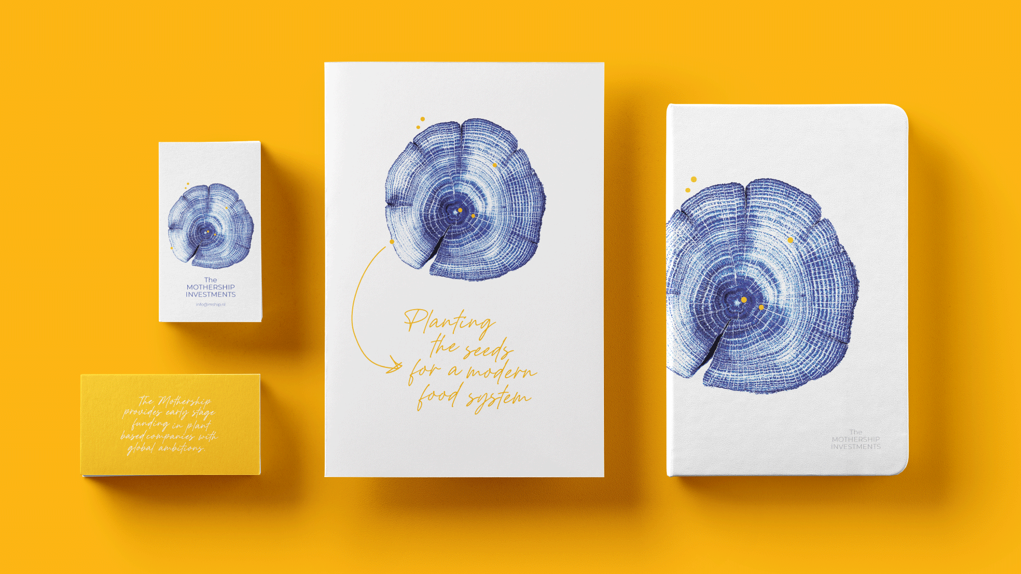
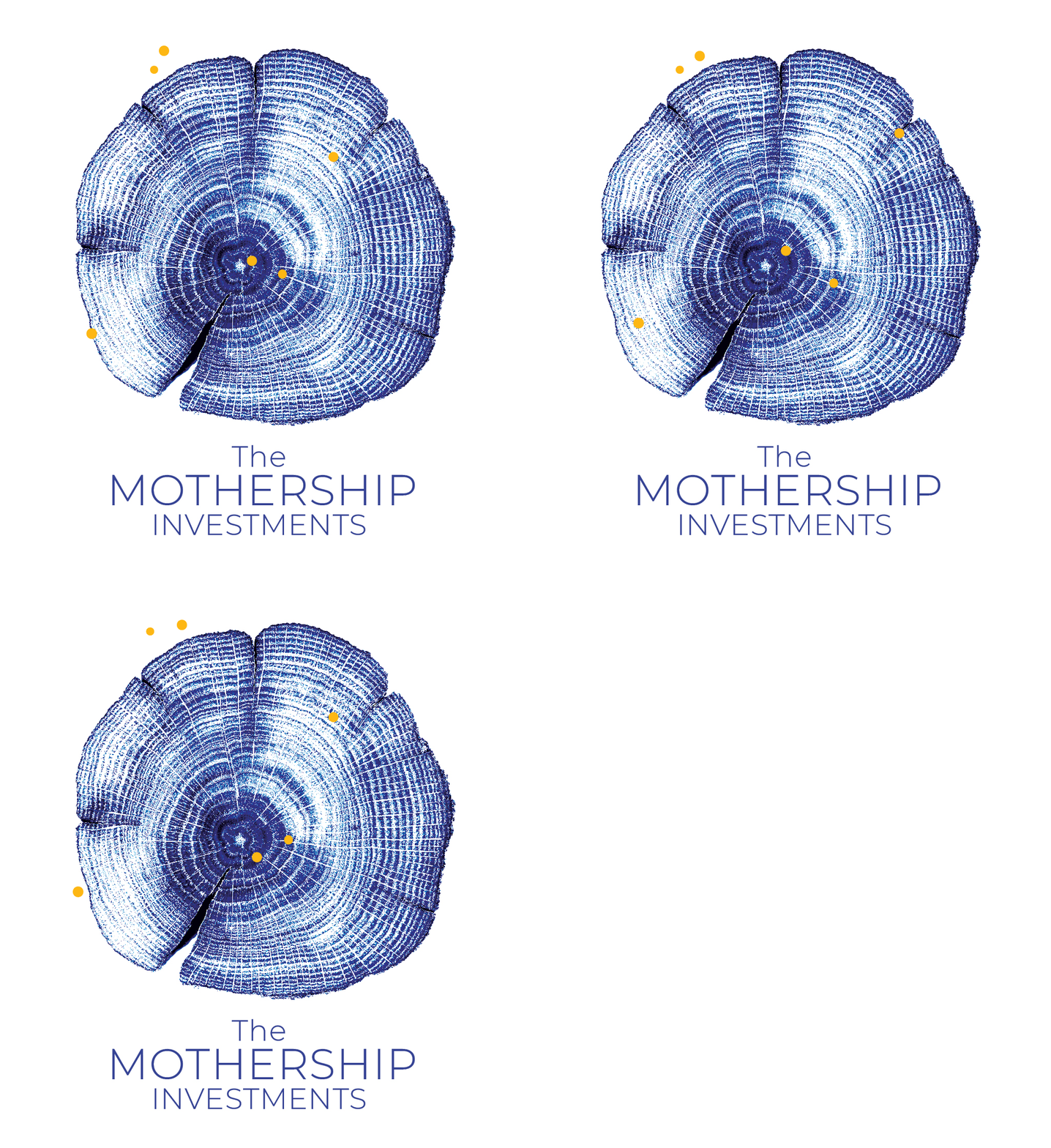
The Mothership invests in the early stages of plant based companies. The visual identity reflects this beautifully with rings of a tree representing growth and golden yellow dots represent investments and support at various stages of a companies development.
Where possible with print, for example the business cards, a metallic gold foil was used. This adds another level of sparkle and strengthens further the identities impact.